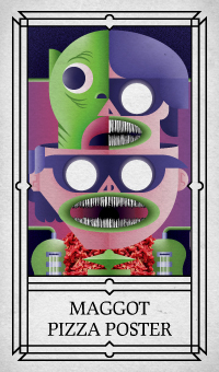
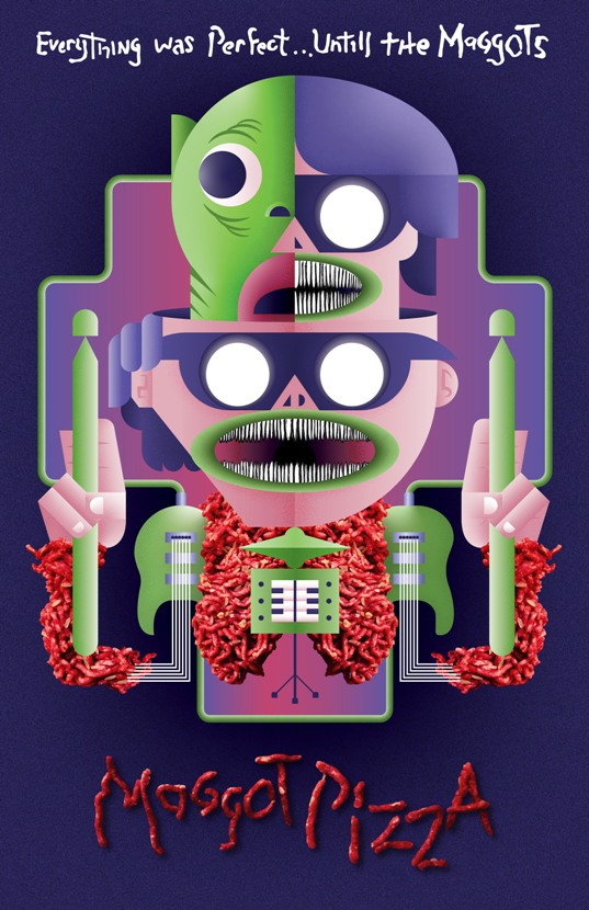
MAGGOT PIZZA POSTER
This is a poster I designed for the band Maggot Pizza. Based in the Niagara region, Maggot Pizza describes themselves as "alien techno dance metal." They are a bizarre band made up of a group of wild performers who truly know how to put on an unforgettable show. For this design, I aimed to capture their high-energy presence while incorporating my geometric art style. Created in Adobe Illustrator, I merged the band members and their instruments into a single, unified entity. The resulting figure is inspired by the shapeshifting alien from John Carpenter's The Thing and the flesh-and-machine hybrid monstrosities from the 1990s film Virus. To emphasize the band's gross-out sense of humor, I incorporated photographs of ground beef and rice that I had taken and merged into the illustration. Additionally, the title "Maggot Pizza" was created using strands of ground beef.
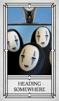
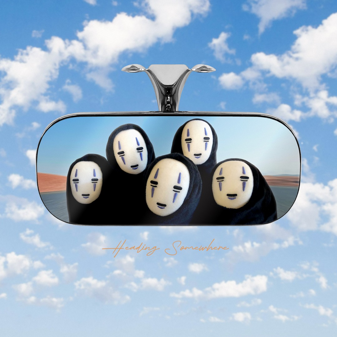
HEADING SOMEWHERE
During the time, I was stuck behind a creative block. That was, until I saw these guys on the shelf at my retail job. They looked funny to me, so I snapped a picture and came up with this phony album cover. Designed using Adobe Photoshop, I was inspired by the album artwork for Vangelis' Spiral and the poster for The Hitcher. Lately, I've been on quite the mental journey and trying my best to view things through a positive lens. I like to imagine that these guys are always right behind me, championing my therapeutic triumphs and eagerly awaiting for my next adventure.
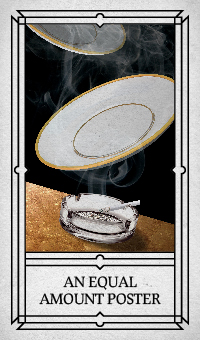
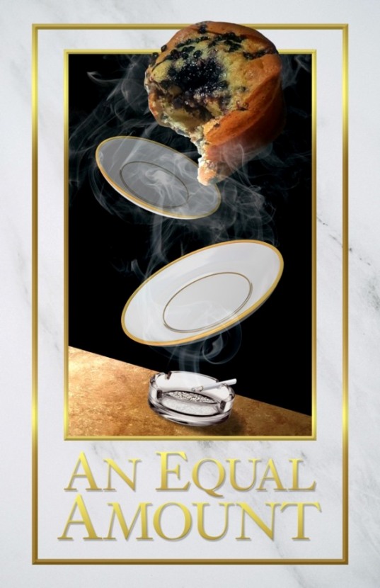
AN EQUAL AMOUNT POSTER
"From now on, I want an equal amount of blueberries in each muffin," demanded De Niro's character in the film Casino. Inspired by this iconic scene from the 90s film, I envisioned designing a poster that captures the essence of the muffin moment in a retro 90s vaporwave style infused with the opulence of a casino. The design would feature elements like white marble, gold trim, and cigarette smoke, elegantly guiding the viewer's eye from a glass ashtray upward to a muffin falling apart from the abundance of blueberries. Designed in Adobe Photoshop.
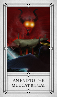
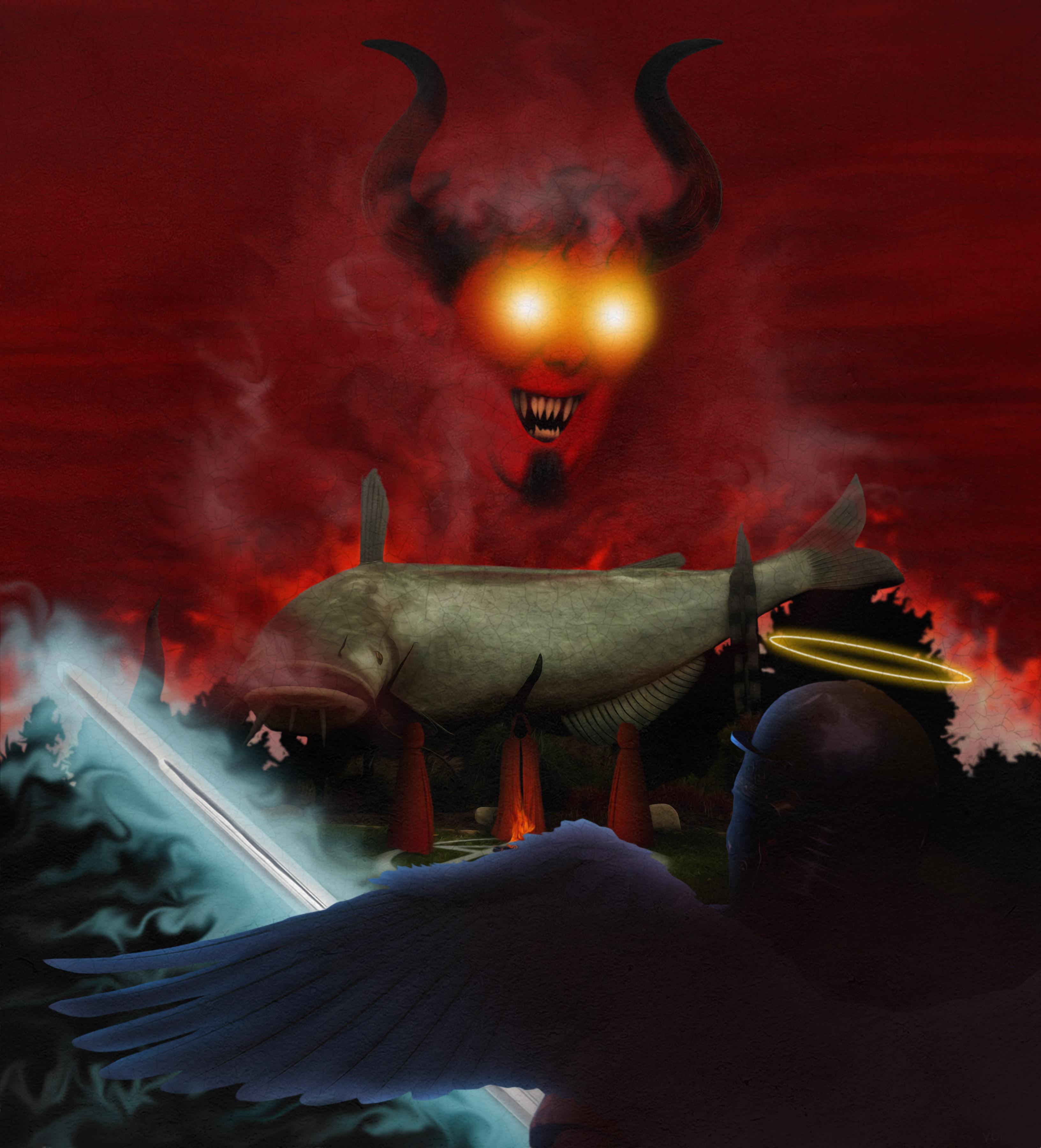
AN END TO THE MUDCAT RITUAL
A Happy Mudcat to all my friends and family of Dunnville. This is an older piece, going back 10 years. It's inspired by a concept that a classmate came up with. I won't name them here, just in case if this is a touchy subject. I always thought it was a fascinating idea and this is my take on it. My goal was to depict it as an epic faceoff between good and evil, rendered in a style reminiscent of some of the epic works from the Renaissance.
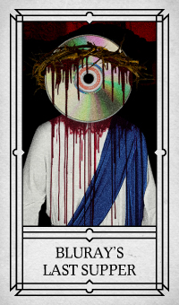
BLURAY'S LAST SUPPER
An editorial collage piece, based on Best Buy's late 2023 announcement that they would no longer
sell DVDs and Blu-rays, has been created. Designed in Adobe Photoshop, it depicts a recreation
of "The Last Supper," with Jesus symbolizing the Blu-ray being betrayed by Best Buy, represented
by Judas.
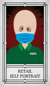
RETAIL SELF PORTRAIT
Another self-portrait of mine reflects how I felt about working in retail and the years of
customer encounters that I wish I could forget. The COVID-19 pandemic truly altered the retail
landscape for the worse, and it nearly drove me to insanity. However, it ultimately motivated me
to apply to school to pursue a degree in graphic design. Designed entirely in Adobe Illustrator.
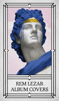
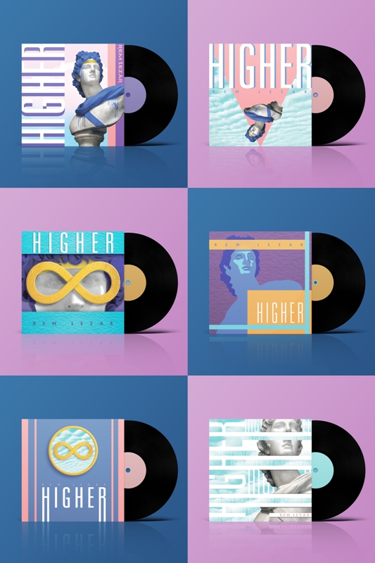
REM LEZAR ALBUM COVERS
Inspired by RedLetterMedia's popularization of the long-forgotten yet amazing children's film
"Creating Rem Lezar," I was tasked with creating a series of album covers for the featured song
"Higher." Given that Rem Lezar was released on the cusp of the late 80s and early 90s, my
concept aimed to evoke a sense of nostalgia by incorporating vaporwave aesthetics, such as a
color palette of blues, pinks, and purples, along with imagery like a Greek statue painted to
resemble Rem Lezar himself. Designed in Adobe Photoshop and illustrator.
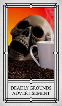
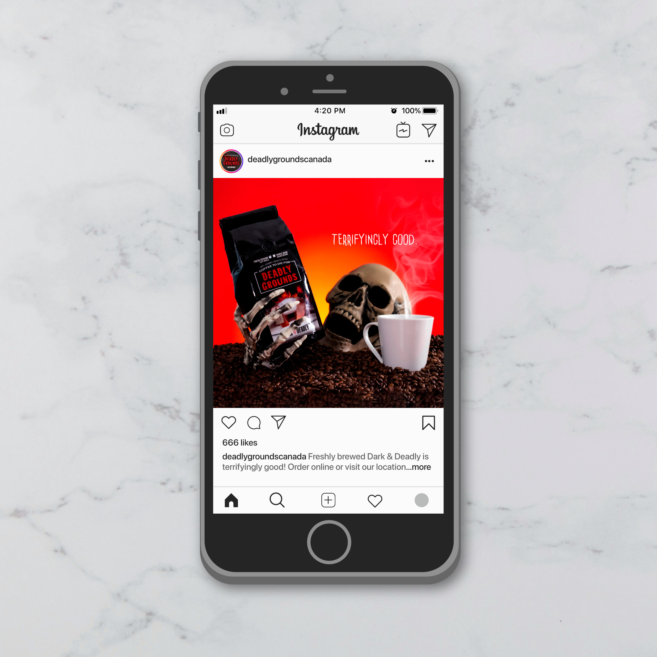
DEADLY GROUND'S ADVERTISEMENT
For my photography class, I was tasked with creating an advertisement for a Canadian company to
be used on Instagram. I chose to design an ad for Deadly Grounds because I admire their company
and their existing marketing efforts. My concept was to create a visually striking ad that
celebrates the theme of horror and evokes the feeling of waking up after sunrise and pouring a
freshly brewed coffee. Designed in Adobe Lightroom and Photoshop
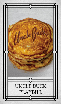
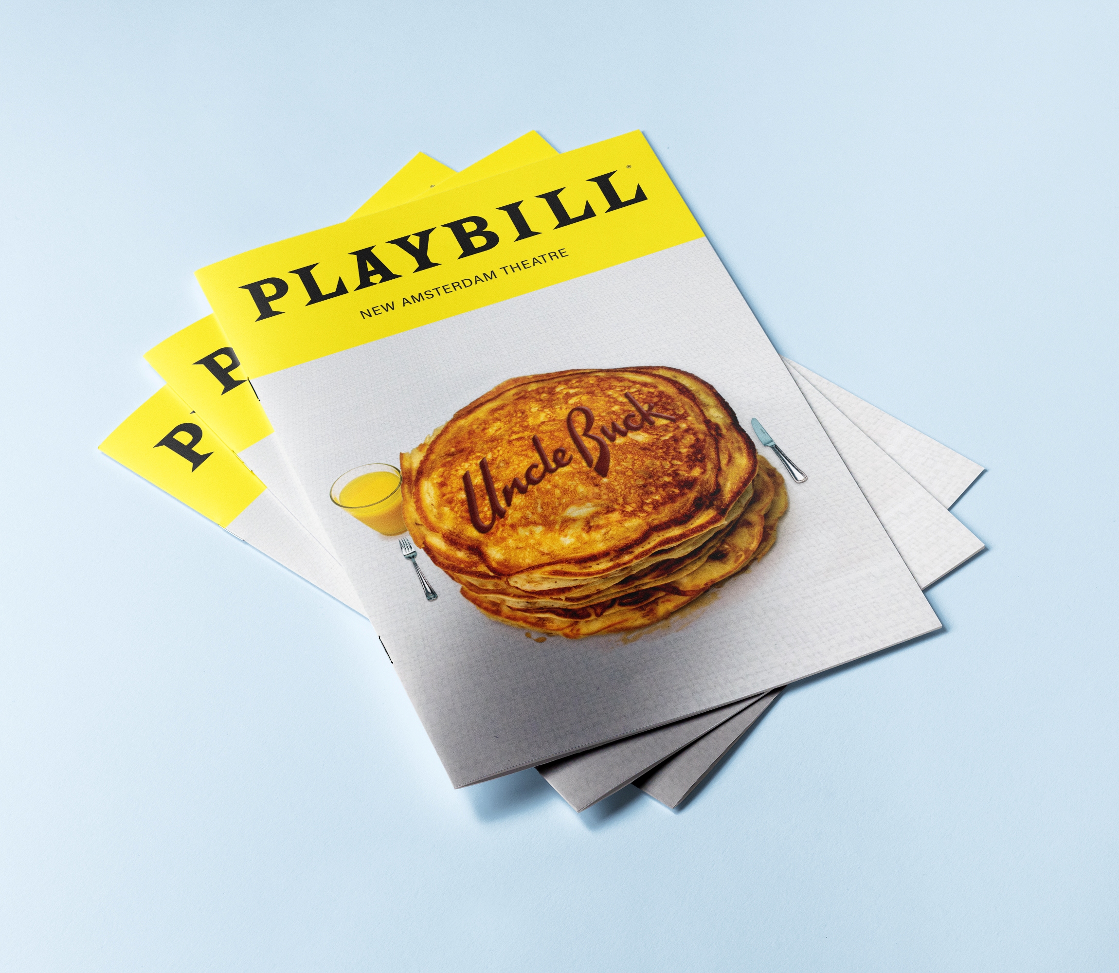
UNCLE BUCK PLAYBILL
For my Digital Illustration class, I was tasked with designing a playbill for a stage adaptation
of "Uncle Buck." One of the most iconic scenes from the movie is when Uncle Buck whips up a
giant stack of pancakes for his nephew's birthday. It's the perfect visual representation of his
big personality and his love and devotion to his family. I photographed the scene, but then
increased the size of the pancakes in Photoshop because I lack the skills and the amount of
ingredients required to make comically large pancakes.
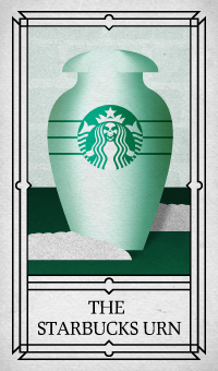
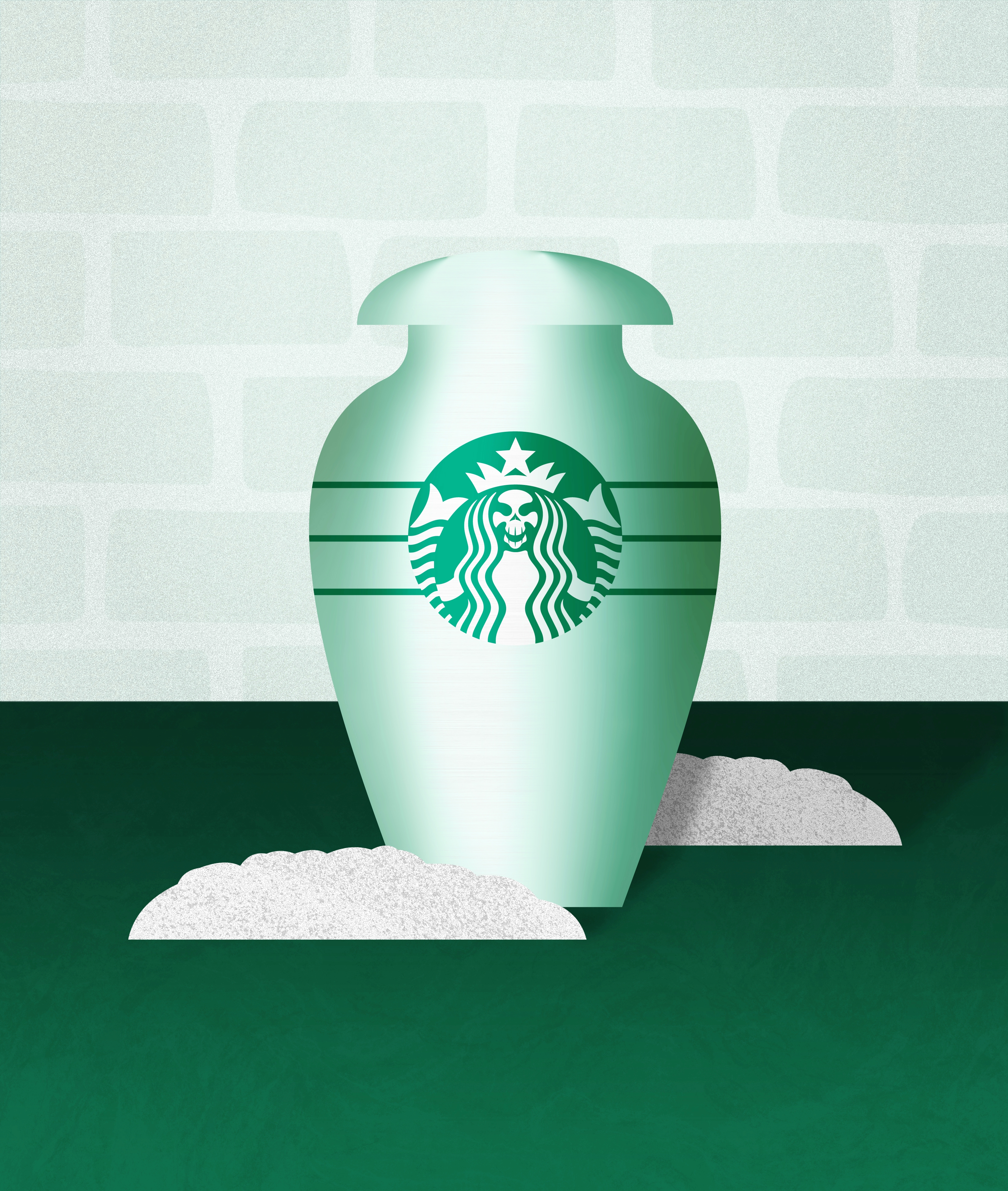
THE STARBUCKS URN
"Do you want to impress the rich people in your life, even from beyond the grave? Then make sure
your ashes are sealed into The Starbucks Urn. Every loyal patron of Starbucks is just dying to
have one." Designed in Adobe Illustrator, I utilized simple shapes, detailed textures, and the
Starbucks colour palette to achieve my concept of The Starbucks Urn.
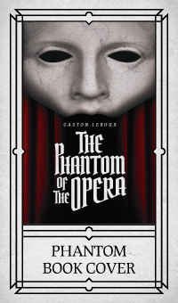
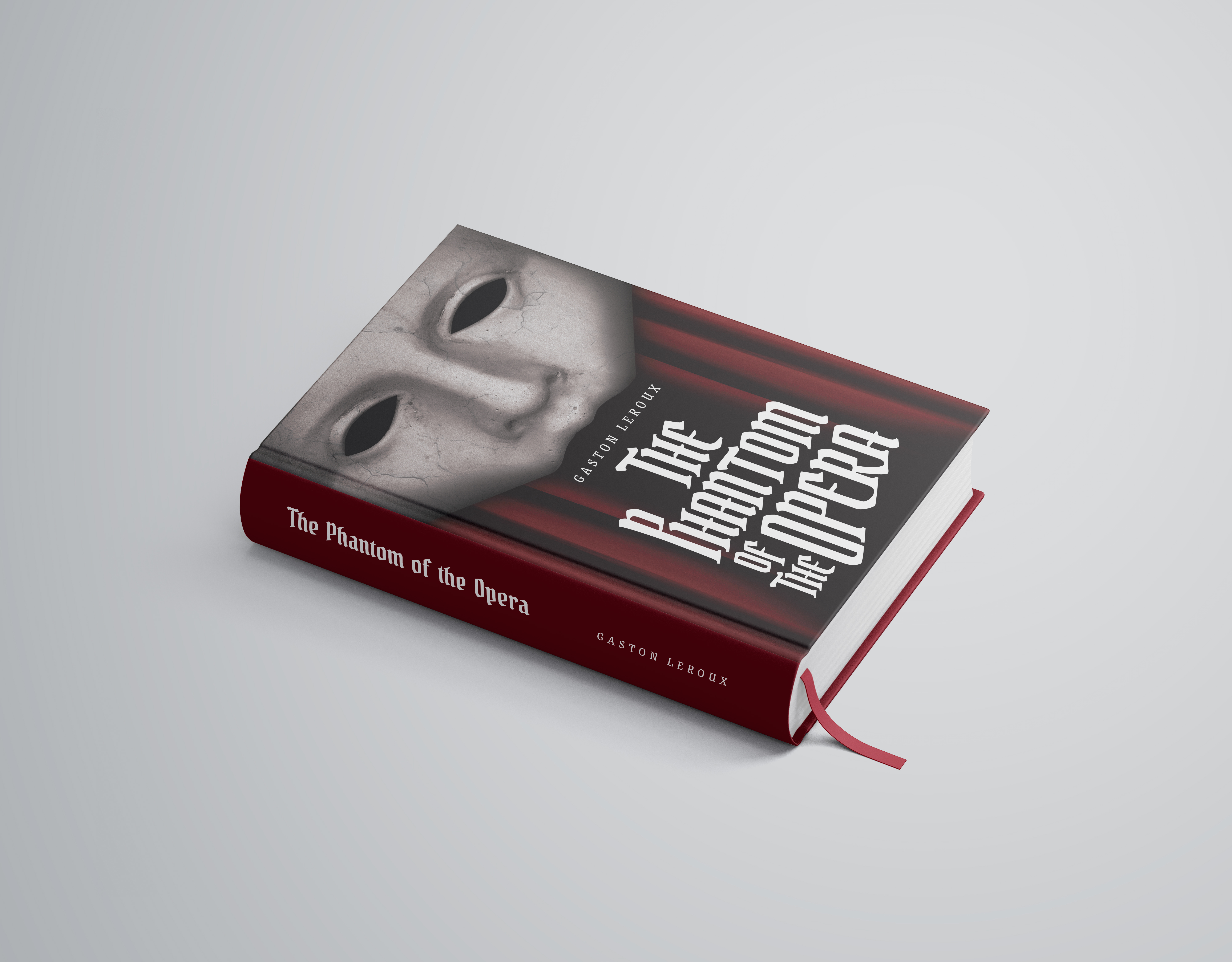
THE PHANTOM OF THE OPERA BOOK COVER
For my book design class, I was assigned the task of creating an original cover for an existing
book. I chose "The Phantom of the Opera" by Gaston Leroux because I have been a big fan of the
musical since I was 9 years old. Designed using Adobe Photoshop and Illustrator, my concept was
to place a significant emphasis on the Phantom's mask, which looms over the opera stage
represented by the red theatre curtains. This directs the viewer's gaze to the title of the
book, set in a powerful gothic typeface. The mask on my cover was actually the face from a Greek
statue, which are typically carved with such symmetrical beauty.
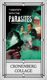
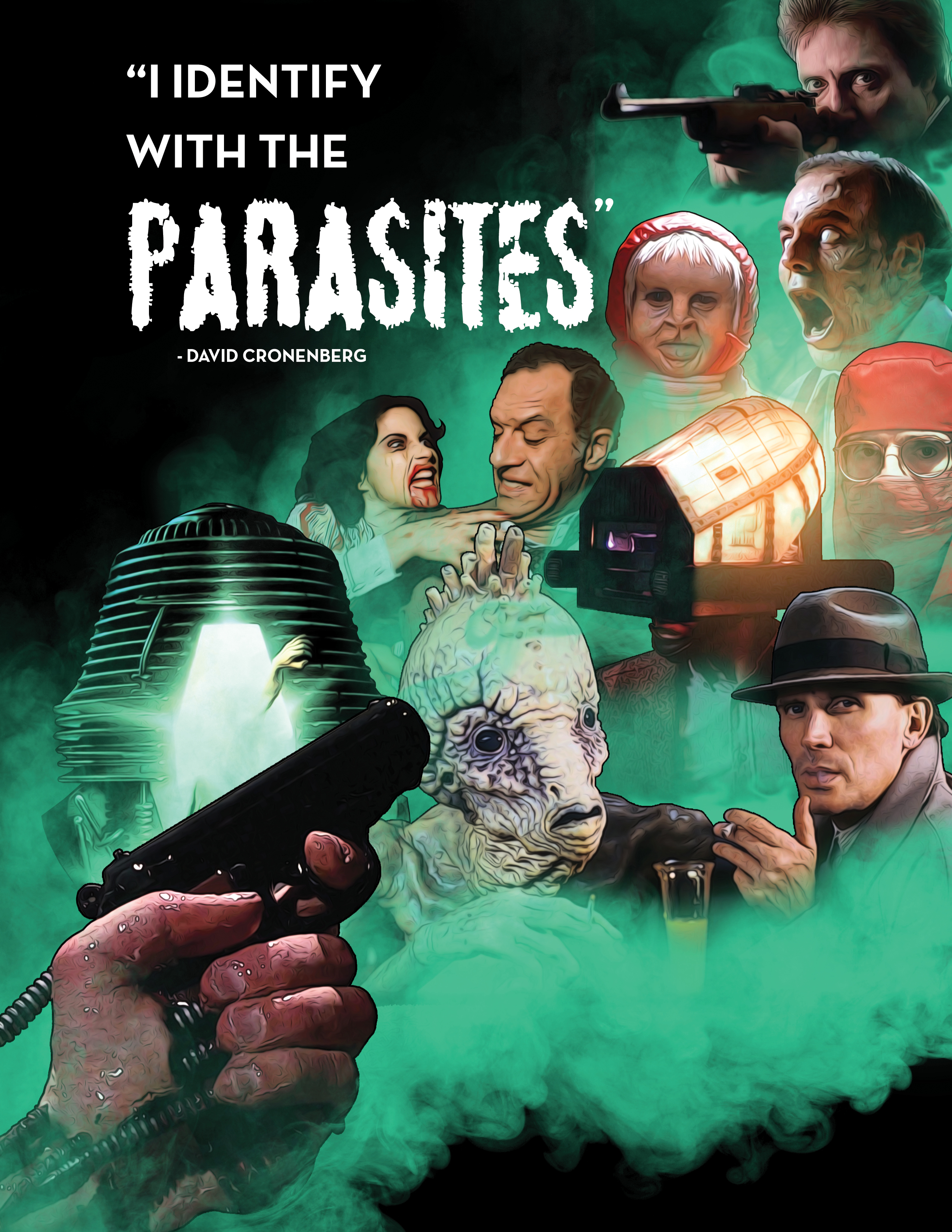
DAVID CRONENBERG COLLAGE
As a fan of David Cronenberg's movies, I aimed to create a piece showcasing his career in film
and his signature trademark of body horror. Designed in Adobe Photoshop, I selected screenshots
from his major films, arranged them aesthetically, and integrated layers of eerie green smoke.
As you view this artwork, remember to cover your mouth, as the effects of inhaling that green
smoke are uncertain.
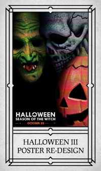
HALLOWEEN III: SEASON OF THE WITCH POSTER RE-DESIGN
For my Design Appreciation class, I was tasked with recreating something for a modern audience.
Being a massive fan of the horror genre, I decided to design a poster for my favorite Halloween
movie, "Halloween III: Season of the Witch". My concept was to create a poster that would align
with the Blumhouse Halloween movies, which were current at the time of designing this poster.
Their posters were very minimal, showcasing just Michael Myers' mask in high detail and the
title. Using Adobe Photoshop, I took photographs of the three masks featured in Halloween 3 and
arranged them in an interesting way that guides the eye through each mask and into the film's
title. An additional layer of scan lines was applied to the masks because the television played
a pivotal role in the film.
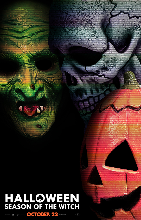
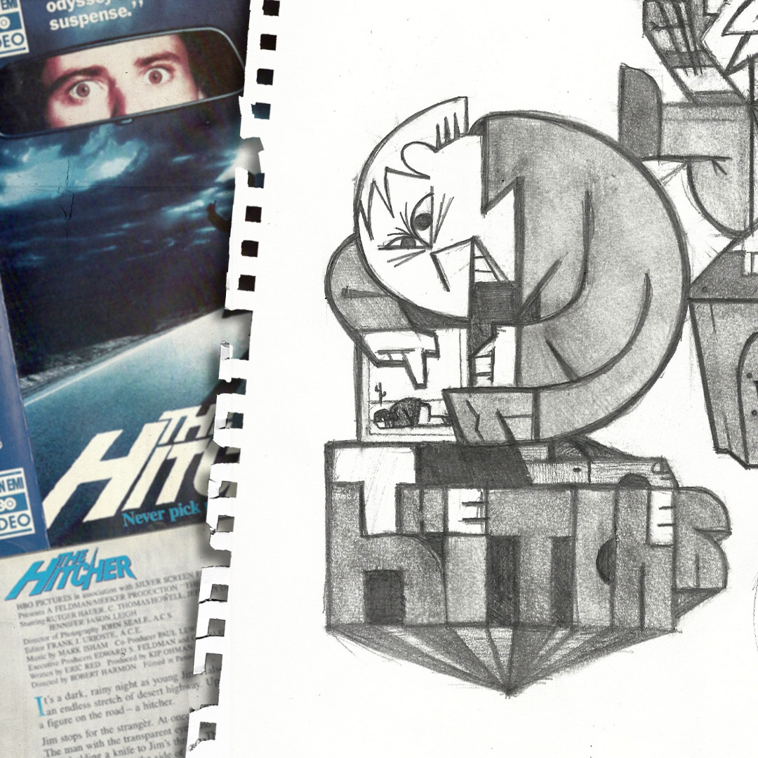
GEOMETRIC HITCHER
After designing my Spooky Self-Portrait, I quickly gravitated toward the art style of geometric construction. This method, which involves stacking and connecting simple shapes to convey complex ideas, is both enjoyable and relaxing. This piece is a tribute to The Hitcher, a film that has influenced me over the years. While watching the movie, I envisioned the protagonist trapped in a jar and tormented by the villainous hitchhiker. I immediately sketched the idea in my notebook and later brought it to life in Adobe Illustrator. To capture the essence of the original film, I used a color palette of cool blues and warm desert yellows.
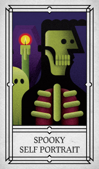
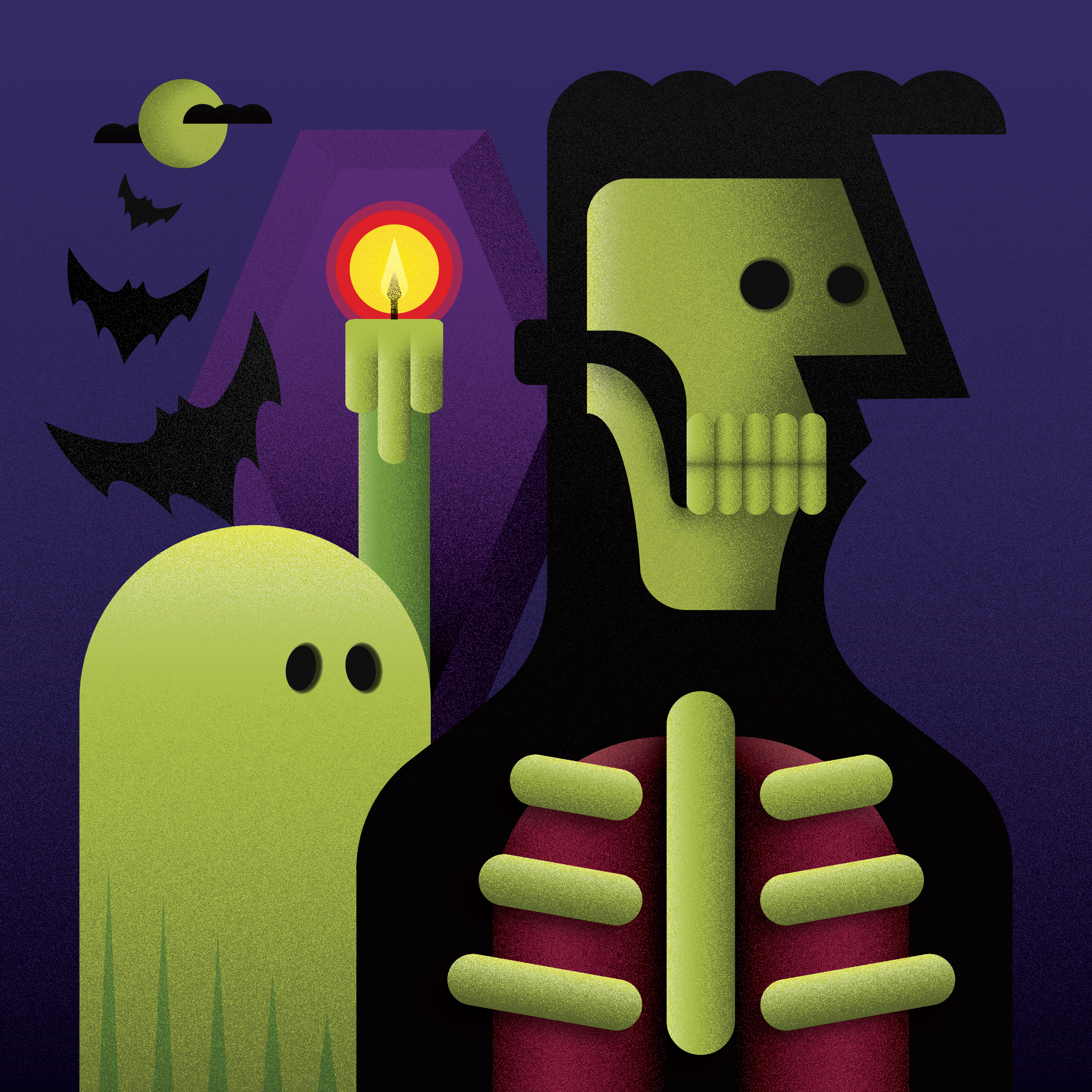
SPOOKY SELF PORTRAIT
A self-portrait of mine that expresses my obsession with anything spooky, such as ghosts, bats,
and the night. Originally drawn by hand and refined using Adobe Illustrator, I aimed to use simple shapes, a four-colour
palette, and grain texture to visualize my concept.
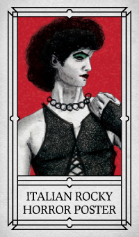
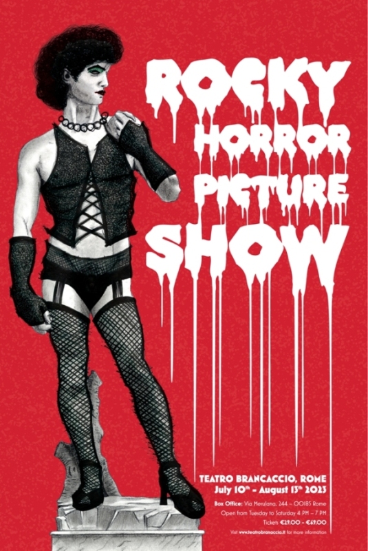
ITALIAN ROCKY HORROR PICTURE SHOW POSTER
For my Ideas and Images class, I was assigned to design a poster for a show or event, with the
twist that it would be situated in an unconventional location. Being a fan of The Rocky Horror
Picture Show, I decided to create a poster promoting its run in Rome, Italy. Italy is not
generally associated with hosting shows that are as raunchy and risqué as Rocky Horror; rather,
it is renowned for its culture, religion, and arts. Taking this into consideration, I developed
the concept of incorporating the Statue of David, but defacing it with Frank N Furter's makeup
and wardrobe. Designed in Adobe Photoshop and Illustrator.
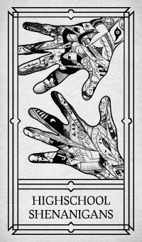
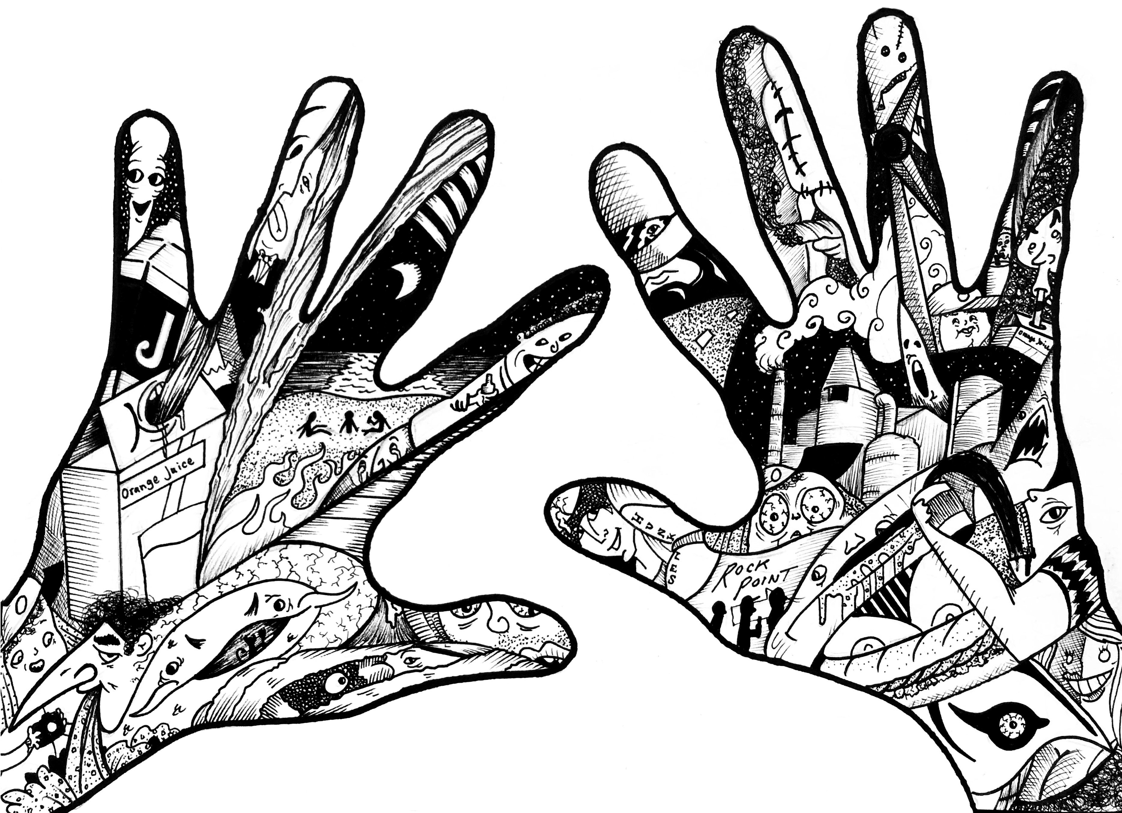
HIGHSCHOOL SHENANIGANS
For an exercise in illustration, I traced my hands, scribbled some lines all around, and
improvised by filling them in. After a few drawings, I devised a way for my hands to tell a
story. Back in high school, my friends and I were night owls who ventured through the
countryside. There's one night that I fondly look back on and it's depicted here in these hands,
along with other relevant memories from that time.
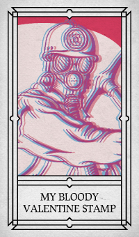
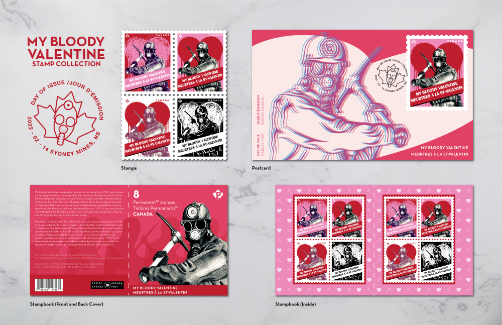
MY BLOODY VALENTINE STAMP COLLECTION
For my design class, I was tasked with creating Canadian-inspired stamps, along with a booklet
and postcard. My concept centered around "My Bloody Valentine," a well-known Canadian horror
movie filmed in Nova Scotia. I sketched several versions of the killer miner character, ranging
from realistic to pointillism styles, which I then digitally rendered using Adobe Illustrator to
serve as focal points for the printed material. I opted for a color palette of pink, red, and
white to not only symbolize Valentine's Day but also evoke the Canadian spirit. Additionally,
the postcard features a 3D effect, inspired by the movie's remake, which was released in 3D.
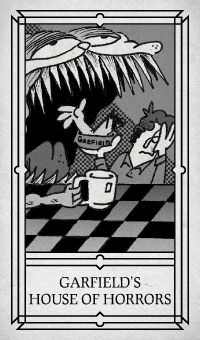
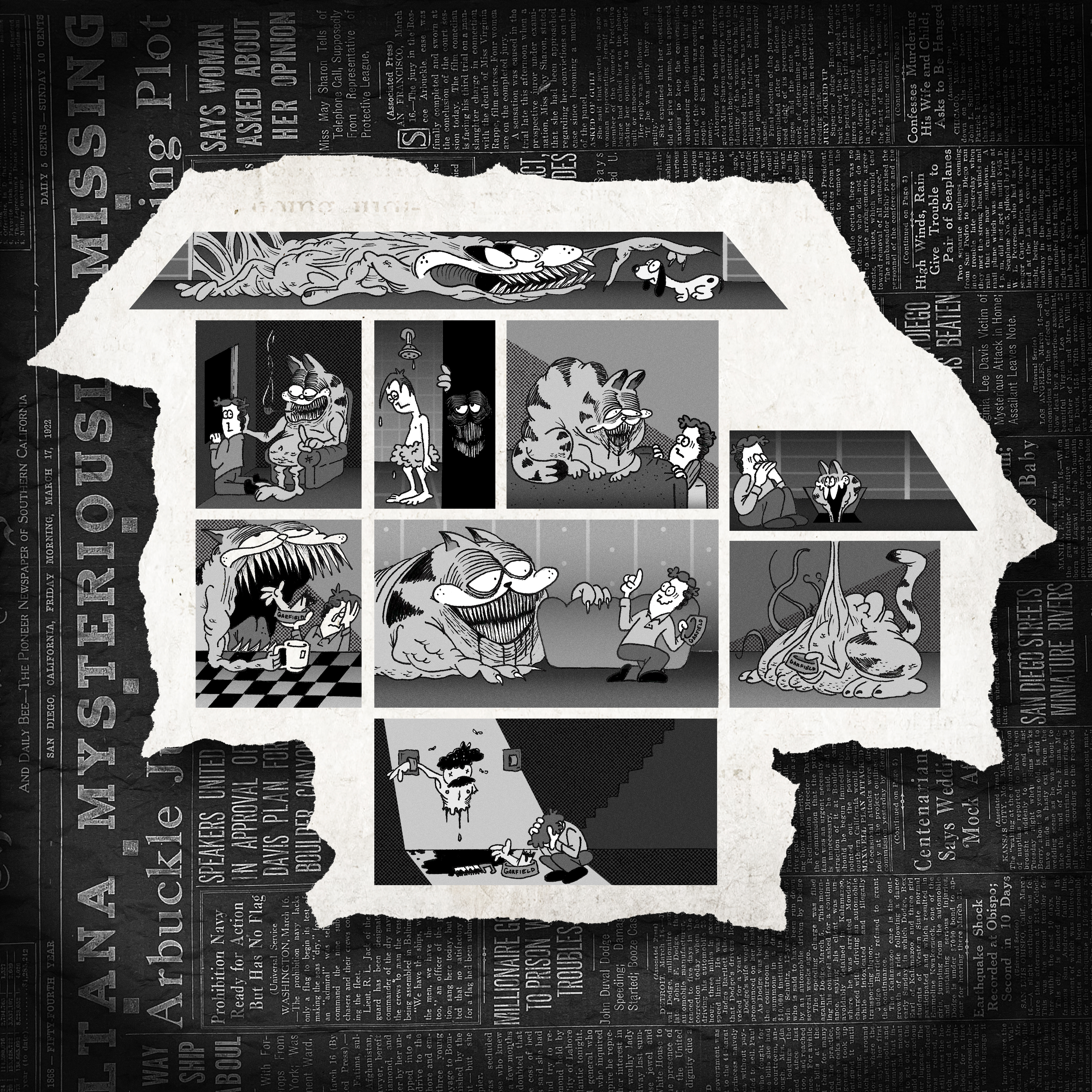
GARFIELD'S HOUSE OF HORRORS
This narrative illustration portrays the unfortunate daily routines of Jon Arbuckle and his
greedy, lazy, and always disgustingly hungry cat. My concept was to depict Jon's house with the
rooms serving as comic panels, akin to those in the funny pages. I aim to evoke the sensation of
witnessing something we shouldn't, as if the actual comics are merely a facade for what truly
unfolds in Garfield. Hence, I incorporated a background of inverted newspaper colors,
reminiscent of scenes in movies and shows where characters sift through old archives of
newspapers on microfilm readers.
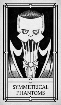
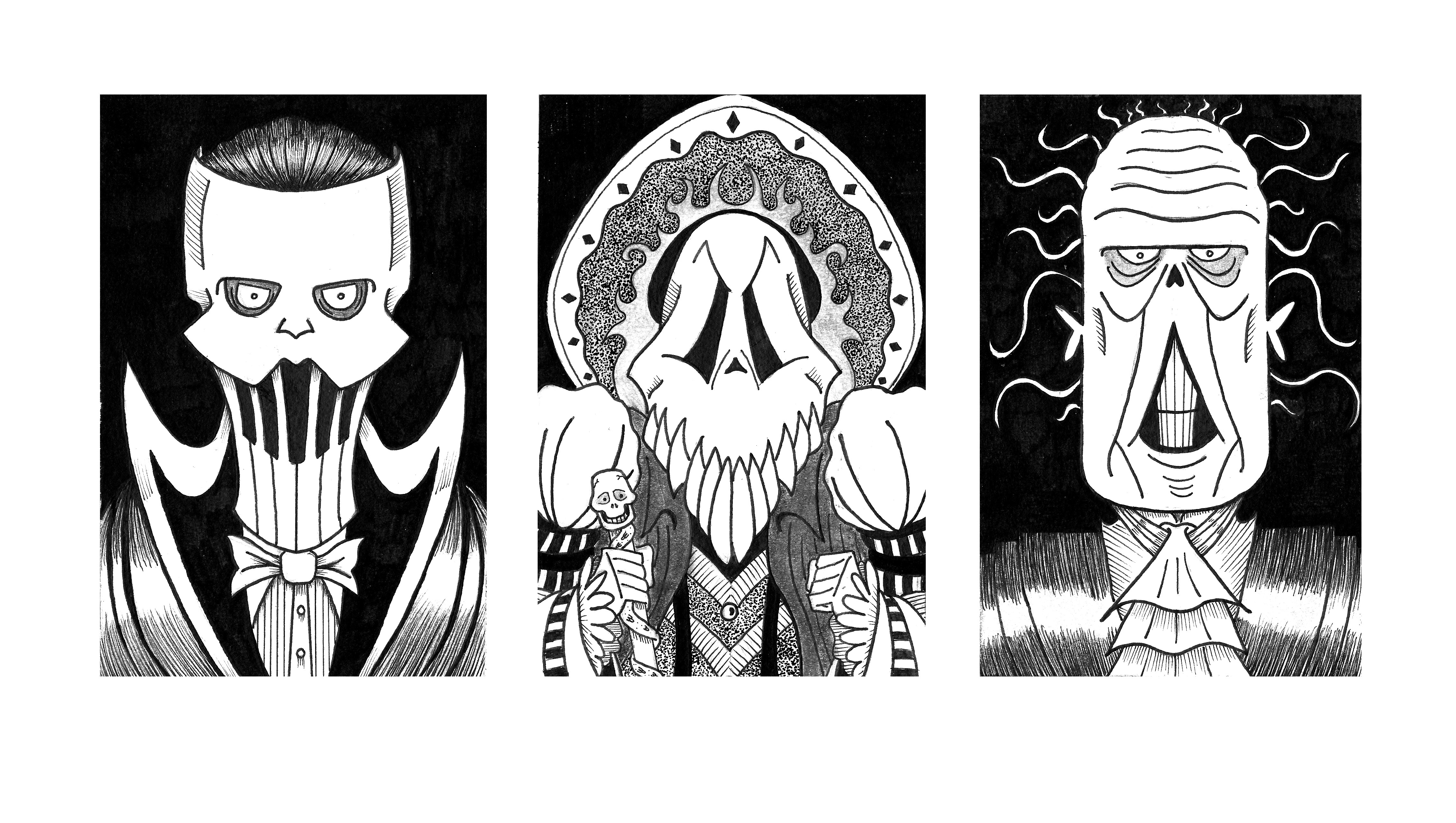
SYMMETRICAL PHANTOMS
For my Illustration Techniques class, I was tasked with creating a three-monster portrait piece
with the requirement that the designs had to be symmetrical. As I've mentioned before, I am a
huge fan of "The Phantom of the Opera" and decided to illustrate the character in three of his
different forms: his common masked appearance, the red death, and his unmasked look. Employing a
cartoonish illustration style, I crafted these Phantoms as original designs while ensuring they
remained recognizable.